
Shalekhet (Fallen Leaves) – Menashe Kadishman
I intend to discuss Shalekhet (Fallen Leaves) by Menashe Kadishman, made from 1997 to 2001, in The Jewish Museum in Berlin. It is contained in a space called Memory Void; designed by the architect Daniel Libeskind. He created empty spaces in parts of the museum that traverse the entire length of the building with the aim of portraying the vacancy of Jews in German Society. Shalekhet is hugely prominent and occupies a large surface area of the museum. It is clear that the installation holds a powerful significance to the museum and subsequently the viewers. This is one of the reasons as to why I selected this work. However, the main reason why it really impacted and registered with me was that whilst there is a clear aim in presenting the plight of the many anonymous Jews. There is also something deeply personal about each face.
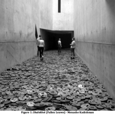
Before you first walk around the corner to be faced with the space; Memory Void. You are given a description of what the piece represents, and who designs the certain parts. Bearing this summary in mind, the uncertainty as to what you are about to face is blown away by a humungous open space that looms over you as you turn the corner, due to the sheer height of the void. As seen in Figure One, the void is rectangular in shape and becomes a dead-end pathway for passers by. The tall, grey walls encase the artwork that covers the entirety of the surface of the floor. As you walk along the void you realise that you are actually stepping on different sized, iron, open-mouthed faces. These varying sized faces are simplistic in design with only a slightly misshapen circle encasing two small eyes holes, nose hole and mouth hole. Each face is unique as there is no specific template for all of them, which on first observation may fool you; believing they are all identical. When you step on the individual faces, lying on the floor, there is a sharp, clinking noise made that immediately echoes around the memory void, creating an eerie and chilling atmosphere. The whole composition is extremely powerful and intimidating. The colour palette is very bland; ranging from mainly grey but with slight tones of black and brown where you can see there has been some rusting. The sheer imposing scale of it emphasises the greyness of it all. As you near the end of the walkway there is an overhanging part of the building that creates a large area of shadow covering the last batch of faces. This brings a rather sinister feel to the walkway as we have been stepping rather carelessly on face after face until we reach this overshadowed part where it is no longer possible to firstly see where your going, or see any more faces. This is a hugely unnerving experience. I don’t believe there is a focal point to this work as, even though the shadowed part creates a heightened sense of drama, you end up having to walk back over the lit up faces also. This surely makes a point about experiencing the entire story rather than focusing on any particular part of the work.
The artist who created this work, Menashe Kadishman, was born in 1932 in Tel Aviv, Israel. This specific work he created was made of sheet steel that was a gift of Dieter and Si Rosenkranz. Kadishman devotes the over ten thousand faces spread across the floor to all innocent victims of war and violence. The spirit of the piece can be interpreted in two ways; the intensely sad feeling or atmosphere the installation forces on the viewer or by the actual thought of how many dead people’s spirits might be contained in the memory void. As you walk across all these faces, it is not only overpowering but also uncontrollably emotive. There is a sense of overcoming sadness and thoughts about what might have happened to these people and how they might have died. They are all presented as anonymous, which only heightens the significance of the piece as the Nazis didn’t care about the individual person in that time in Germany, therefore in both cases, the people remain indistinguishable.
Kadishman was son of Bilha, a painter and teacher, and Ben Zion Kadishman, a sculptor and industrial worker, therefore engulfing him in art from youth. At age fifteen he began to study with Israeli sculptor Moche Sternschuss at the Avni Institute of Art and Design in Tel Aviv for three years. At twenty-two he studied with the Israeli sculptor Rudi Lehmann in Jerusalem. Later in his life he moved to London and studied at Saint Martin’s School of Art and the Slade School of Art, where he worked with Anthony Caro and Reg Butler. When reviewing all these artist’s works there are similar comparisons to be drawn. They all have minimalist styles that concentrate on balance, construction and similar choice of industrial materials.
Critically he has been well received and even had tributes for him, as he is believed to have ‘succeeded in bridging the gap between the art world and the general public’[1]. This is particularly shown in Shalekhet due to its unpretentious depiction of people who have died. Moreover, he ‘felt equally comfortable as a successful artist on the Israeli and global art scenes as he did in commercial galleries’[2]. He is very much politically, socially and environmentally involved and his values generally centre on current affairs whilst also drawing influences from Israel. The on-going Israeli-Palestinian conflict bears some relationship to happenings in Nazi Berlin and inspires him to create similarly revolutionary artwork. Shalekhet aims to look at the incompleteness of Germany at the time and how much pain the citizens had been put through. There is an eerie sense of loss that is addressed post Nazi control in Germany. As Henry Lee puts it; ‘I also feel what is unmistakably guilt as I tread on the “screaming” faces. Am I walking over representations of living breathing people?’[3]. This is very much similar to the feeling I experienced as I passed through the many faces.
Overall, Kadishman’s piece Shalekhet is hugely imposing and emotive. The choice of material, scale and thought process for how the artwork would fit into the Memory Void all pull together in a way that gives respect and honour to the innocent who died from War or Violence. The installation therefore reveals the devastation caused on a grand scale and really forces you to contemplate human failings and the consequences of those failings on groups of individuals and what can be done to avoid indiscriminate acts of violence in future.
Bibliography:
Websites
Lee, Henry. “Shalechet (Fallen Leaves), Jewish Museum Berlin”. (Fotoeins Fotografie: 2013). https://fotoeins.com/2013/04/02/shalechet-jewish-museum-berlin/
Peleg-Rotem, Hagit. “Kadishman bridged gap between art world and public”. (Globes: 2015). http://www.globes.co.il/en/article-kadishman-bridged-gap-between-art-world-and-public-1001038845
[1] Hagit Peleg-Rotem, Kadishman bridged gap between art world and public, (Globes: 2015)
[2] Hagit Peleg-Rotem, Kadishman bridged gap between art world and public, (Globes: 2015)
[3] Henry Lee, Shalechet (Fallen Leaves), Jewish Museum Berlin, (Fotoeins Fotografie: 2013)
Lilith am Roten Meer – Anselm Kiefer
I intend to discuss Lilith am Roten Meer by Anselm Kiefer completed in 1990. The work is held in the Hamburger Bahnhof museum in Berlin. Kiefer is evidently a very important part of the museum; he is clearly promoted as a prominent and significant artist to observe as a few of his very large-scale pieces take centre stage in the first couple of rooms. As a viewer the interesting works of art immediately strikes you. For me, this was the case when faced with the violent but muted works of art
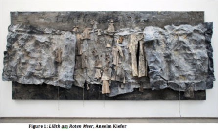
The piece, Lilith am Roten Meer, is hung against a blank, white wall and is extremely imposing on first view. As seen in Figure One, it originally seems to be a painting, whilst also containing three-dimensional segments to the piece concludes it is a sculpture. This large scale artwork, 280 by 498 centimetres, thus creating an immediate imposing effect to those looking at it. The large canvas is covered in materials such as lead, adult’s clothes and children’s clothes, steel wire and ash. The whole thing is painted in tones of grey and small amounts of copper in places. The big, flat canvas is layered with thick paint and at the top it reads ‘Lilith am Roten Meer’ which is harshly and almost indecipherably etched into the paint. Through the width of the canvas, horizontally stretches the three-dimensional part of the piece. In this centre part of the piece are a few tattered looking grey cloths and hung on top of them are the adult and children’s clothes, flanking this are two large grey squares which project forwards to the viewer. The squares appear very creased and on top of them are a few clothes, but not as many as in the centre. The composition, in general, is very disarrayed and unorganised, however symmetry is created by the placement of the projecting sections. These sections are the focal point of the piece, especially where all the clothes are gathered at the centre of the work. This definitely affects the overall work as the viewer is taken on a story from either side of the canvas to the middle.
Lilith am Roten Meer is a piece that depicts the horrors of the Holocaust and all the people who died in it. Instead of a memorial, however, it acts more as a saddening presentation of the terrible things that happened. As a viewer you are encouraged to feel remorse and an overwhelming sense of guilt for the people who died. The Guardian discusses Kiefer and mentions that critics ‘tend to moan that he is a little bit melodramatic’[1] and that his ‘art is loaded with the past, caked with the mud of battles, clogged with ashes of the murdered’[2]. However, Kiefer in this particular exhibition and in regards to Lilith am Roten Meer believes that he ‘challenges Germany’s response to the atrocities. However, his refusal to negate national heritage in the name of collective guilt has also brought him detractors’[3]. As he said in a 2008 speech reprinted in the exhibition catalog, “The wounds were not bandaged; they were shamefully hidden instead.”’[4] The article goes on to say; ‘To some critics, it is all a bit manipulative and heavy-handed…There is some truth to this, and a few works come across as simplistic, but the overall effect is quite powerful’[5] and in reference to Lilith am Roten Meer it is described as ‘more mournful than exploitative.’[6] This can be seen by the modest, muted colour palette and lack of over extravagance, to the work.
Kiefer’s personal influence derives from his desire to transform something thus creating an instantaneous, materialized image, otherwise known as Expressionism. Although it is clear that Kiefer worked on Lilith am Roten Meer for a long time, in contrast the viewer, is given only a snapshot of the Holocaust and what it was like. There is a significant amount of symbolism used in his work that is usually indecipherable, ranging from private connections, pagan and Christian mythology, history and cultural references. The holocaust and finding a resolution to it also plays a huge part in many of his works. Therefore, this work is very politically, socially and environmentally charge, due to the subject matter.
The year before this work was made the Berlin Wall had just come down. This hugely significant part of Berlin history instigated a movement in revolutionary art fueled by the terrible happenings that commenced over the past years, such as the Holocaust. This is particularly shown in this work due to attributes such as dull colour palette, heavy and weighted look to the work and scale of it. Moreover the part of the title; Am Rotten Meer links to ‘Israelites who miraculously crossed to freedom and the Egyptians who were swallowed by the water.’[7] This is a clear reference to the wall and how the East Germans broke free and crossed the border leaving the authorities behind. Therefore not only visually does the work link socially to current affairs but so does the title; which is also inscribed into the work, emphasising the brutal message of the piece.
Overall, in Lilith am Roten Meer, Kiefer depicts the harsh experiences of the Holocaust through the use of materials, visual language and clearly thought through directives. This can be seen mainly by the mass of the piece, as it looms over you but also in the influences he has taken from. These political, social and environmental pressures shine through very clearly so that the viewer is overwhelmed with mournfulness and it is as if they have themselves been lurched back in time to when these horrors had happened. This particularly hits the viewer when looking at the focal point of the work; the empty clothes hung up, which used to belong to someone who has now clearly gone. The whole piece is very devastating, shocking and unforgettable.
Bibliography:
Websites
Jones, Jonathan. “Anselm Kiefer review – an apocalyptic epitaph for the liberal age”. (The Guardian: 2016). https://www.theguardian.com/artanddesign/2016/nov/21/anselm-kiefer-review-walhalla-white-cube-bermondsey
Rosenfeld, Jeannie. “KIEFER’S OTHER LAND”. (Tablet: 2010). http://www.tabletmag.com/jewish-arts-and-culture/51363/kiefers-other-land
[1] Jonathan Jones, Anselm Kiefer review – an apocalyptic epitaph for the liberal age, (The Guardian: 2016)
[2] Jonathan Jones, Anselm Kiefer review – an apocalyptic epitaph for the liberal age, (The Guardian: 2016)
[3] Jonathan Jones, Anselm Kiefer review – an apocalyptic epitaph for the liberal age, (The Guardian: 2016)
[4] Jeannie Rosenfeld, KIEFER’S OTHER LAND, (Tablet: 2010)
[5] Jeannie Rosenfeld, KIEFER’S OTHER LAND, (Tablet: 2010)
[6] Jeannie Rosenfeld, KIEFER’S OTHER LAND, (Tablet: 2010)
[7] Jeannie Rosenfeld, KIEFER’S OTHER LAND, (Tablet: 2010)
