Editor’s Note: Carol A. Wells is the founder and executive director of the Center for the Study of Political Graphics, an educational and research archive with more than 90,000 social movement and protest posters from around the world. www.politicalgraphics.org
Story highlights
Political posters remain one of the most effective and powerful tools for communicating with voters
They can hold leaders accountable, poke fun at people's weaknesses, and possibly even influence election outcomes
The pedestrian visual language of established party candidates makes the all too rare, visually adventurous political campaign posters memorable and effective.
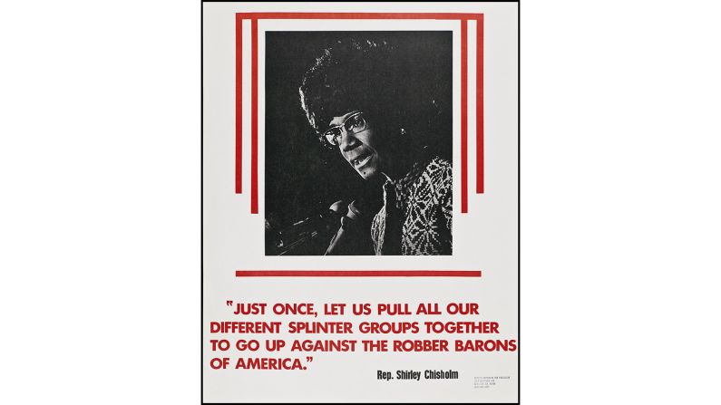
The best ones that promote a candidate inspire hope and optimism. The best ones that oppose a candidate use humor or satire to critique the candidate for what they’ve done, or for what they promise or threaten to do.
If you can laugh at someone, you can challenge them, and posters remain one of the most effective and powerful tools for holding political leaders accountable. They can make fun of their foibles, and spur activism around a wide range of causes.
Graphic distinction
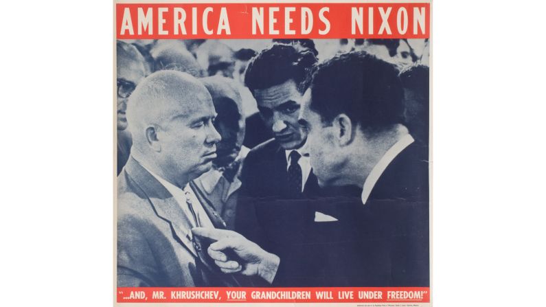
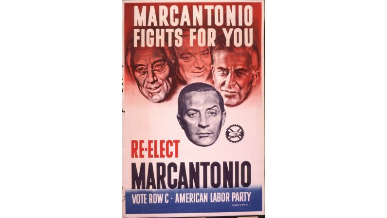
To be frank, the vast majority of U.S. campaign posters are boring. Most are simply a logo and text of the candidate’s name, with or without a photo. If there is any graphic element, it is usually the U.S. flag or a deconstructed reference to the flag.
At best, it’s the kind of simple statement that works to reinforce name recognition, whether on the convention floor or as a lawn sign. They can be easily read from afar, but add little to viewers’ understanding of the candidate or the issues.
Their purpose is to cajole people who may be undecided to vote for whoever seems to be the most popular candidate – and the more signs out there, the more popular that candidate will appear.
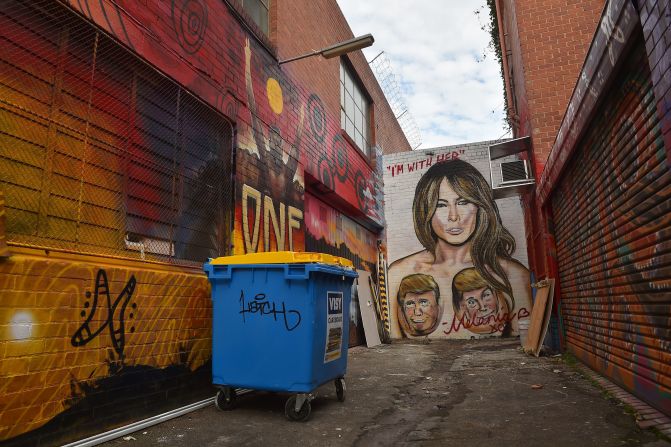
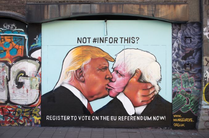
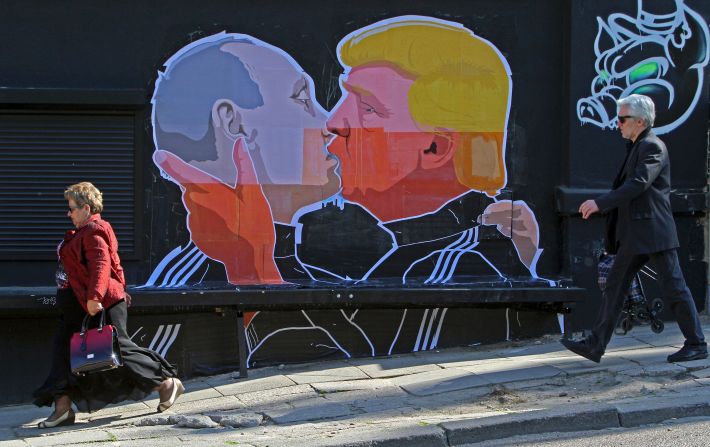
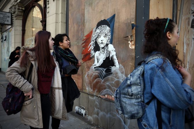
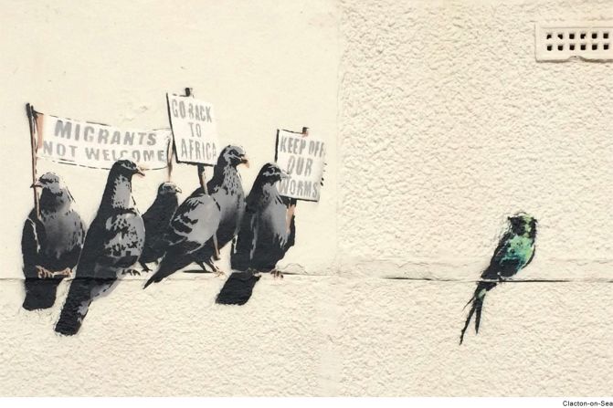
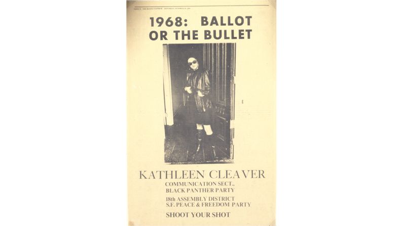
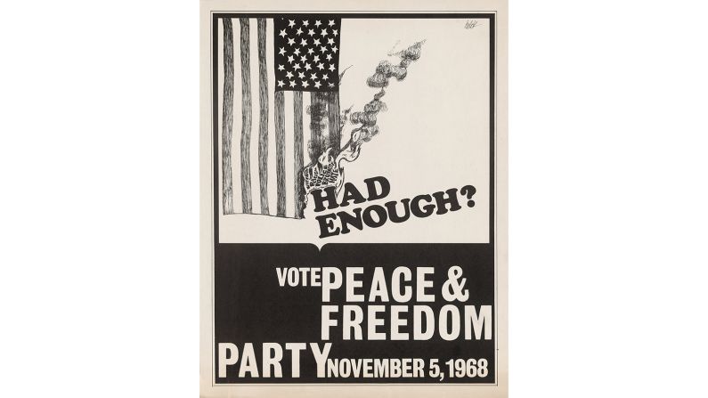
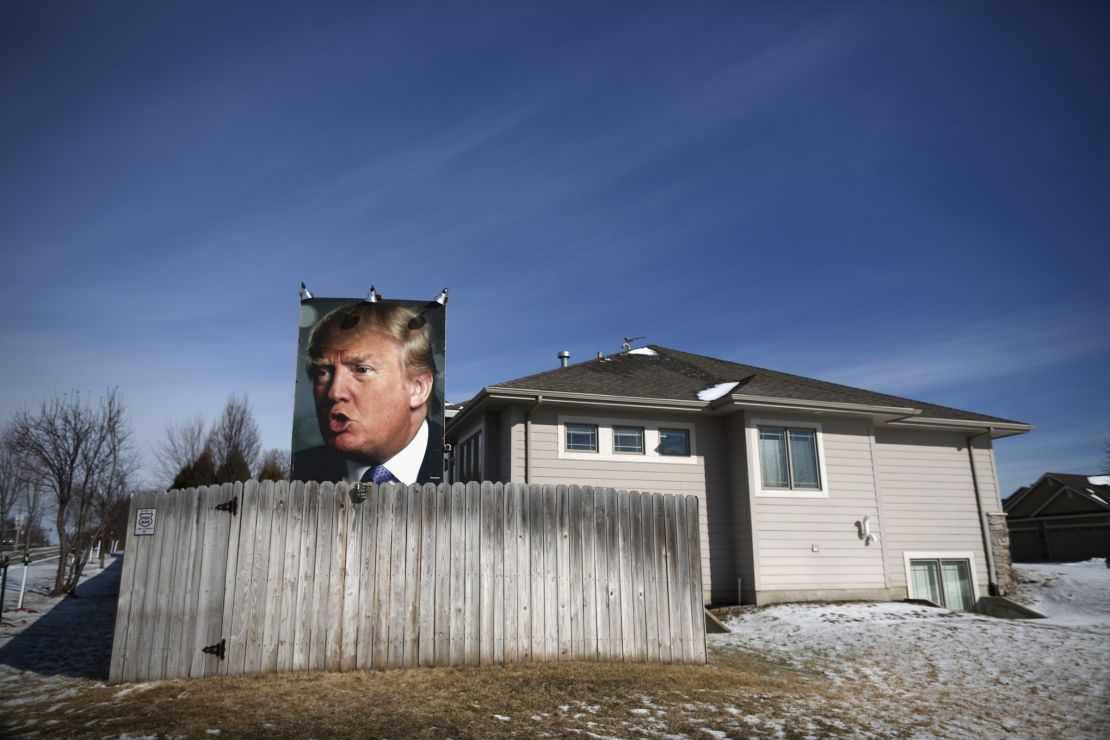
When street art meets politics
However, there is a dramatic distinction between the posters produced by the official campaigns, and those produced by a candidate’s informal supporters.
Official campaign posters tend to be graphically conservative and visually safe.
Too many people – especially in the U.S., where arts education has been reduced or eliminated from the school curriculum – are uncomfortable or even threatened by any image that is not immediately understood or requires interpretation.
Although great art intentionally pushes boundaries and challenges viewers’ comfort levels, campaign posters need to convey stability and promote confidence.
So it’s not surprising that some of the best electoral posters do not support the establishment candidates who have the most to lose by looking too avant-garde or edgy.
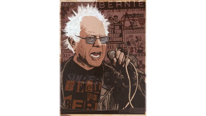
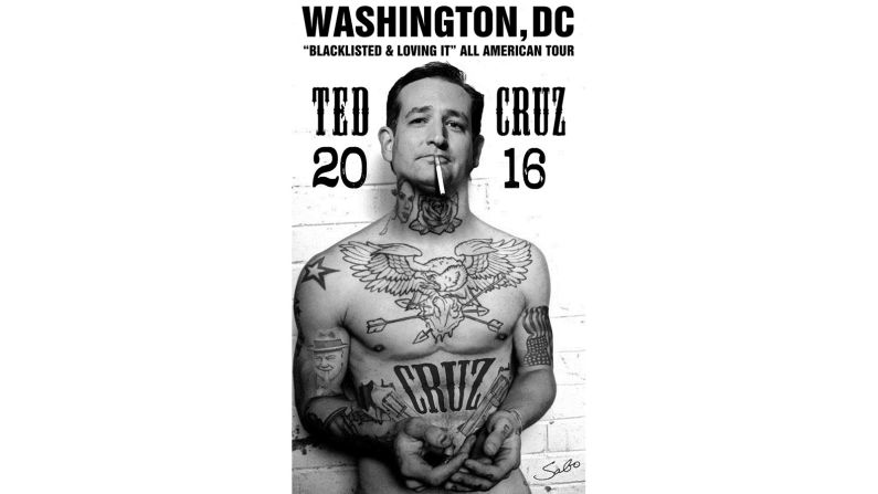
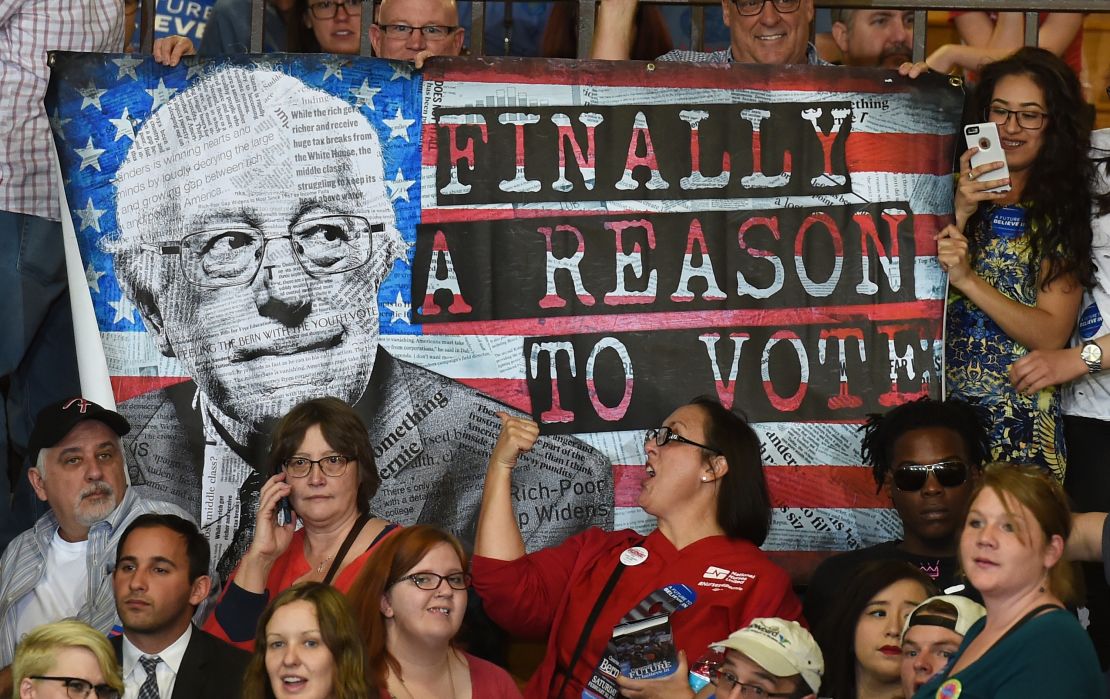
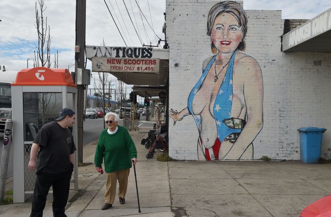
Whether a punk Bernie Sanders by ABCNT, or a tatted, buff and shirtless Ted Cruz by Sabo – both of whom are anonymous street artists – the most imaginative, provocative, and sometimes fun posters either support candidates seen as long shots, or oppose the nominees.
History-changing visuals
That said, there are exceptions, and at least one campaign poster is credited with helping change political history.
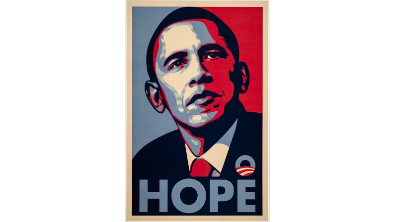
Shepard Fairey’s 2008 “Hope” poster brilliantly captured the country’s need for optimism and hopefulness after eight dismal years of George Bush II.
That the image immediately went viral is proof of the emotional connection it had with potential voters, especially youth. Many believe this poster inspired enough voters to give Obama the edge that he needed to win.
Resonating beyond that campaign, the poster changed graphic design history.
Countless politicians in subsequent U.S. elections scrambled to commission their own version of the now iconic “Hope” poster, while parodies were used to oppose candidates, with the word “Hope” transformed into “Nope” or “Dope.” Parodies with the word “Grope” have recently gone viral in response to the infamous Trump tape.

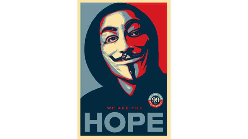
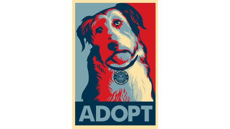
The artist himself also reused the design to promote causes ranging from Occupy Wall Street to animal rights.
Fairey’s highly recognizable style has also been adopted abroad in Europe, North Africa and Australia, primarily to oppose politicians in power but also to support diverse individuals and causes.
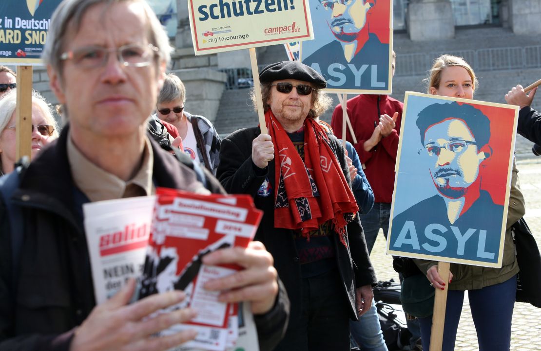
Most notably, his style was appropriated by activists to support and express solidarity with Julian Assange, where “Hero” replaced “Hope,” and Edward Snowden, where “Hope” was replaced by “Truth.”
Despite the modern technology that facilitates such appropriation, and the way the Internet is radically transforming how political graphics are disseminated, countless numbers of these posters are still being printed on paper.
They will continue to be used for the foreseeable future, not only because Internet access is not available to everyone, but because people cannot raise up their computer monitors in a convention, carry them in a demonstration, plant them on their lawn, or paste them onto walls.
As long as people have political opinions, printed posters and their unique forms of art are a fundamental tool to express them.
The Center for the Study of Political Graphics is an educational and research archive with more than 90,000 social movement and protest posters from around the world. The collection contains works from the 19th century to the present, and includes the largest collection of post WWII political posters in the U.S. Through traveling and online exhibitions, publications, workshops and internships, CSPG is reclaiming the power of art to educate and inspire people to action. Poster donations are welcome. www.politicalgraphics.org